Jasmine Davis AS Media Studies
Friday, 13 May 2016
Blood Bath final production
In the link below is the opening sequence to my film Blood Bath which is a horror film about a mum and her daughter that go and visit a house that they are thinking of buying .
But there is a twist to the story because the owner who is taking them around the house is insane and he falls in love with the mum but he finds it hard to communicate with women due to his traumatic past experience with his mum .
What will happen next ?
Click the link below to find out .
https://www.youtube.com/watch?v=AtIFFLMxrQI
Tuesday, 10 May 2016
opening scene anlaysis 3
Insidious
This story is about a family who are looking for their son Dalton played Ty Simpkins who feel into a coma after a mysterious incident in their attic , but they soon find out that it is not just little sleep that their son is lacking as they explore the paranormal and learn more about the past which is getting their son back once and for all .
The film poster uses dark colours for example the clouds starting to fade over and the child look a bit intimidating as their looks like their are dark circles under his eyes and the bottom half of the child's clothing is dark whereas the top half is in colour also the expression on the child's face looks like he is lost and that he is a kid not to be messed with .
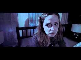
The character looks shocked and very scared they also don't know that their is a shadow behind them watching their every move , and that can make the audience want to tell the character and it can make the audience annoyed or frustrated that the character cant see what is behind them , so that is a good technique to have in a movie as both the audience and the characters can interact with each other
This story is about a family who are looking for their son Dalton played Ty Simpkins who feel into a coma after a mysterious incident in their attic , but they soon find out that it is not just little sleep that their son is lacking as they explore the paranormal and learn more about the past which is getting their son back once and for all .
The film poster uses dark colours for example the clouds starting to fade over and the child look a bit intimidating as their looks like their are dark circles under his eyes and the bottom half of the child's clothing is dark whereas the top half is in colour also the expression on the child's face looks like he is lost and that he is a kid not to be messed with .
The font is big and the letters are all next to one another this could suggest how close they were as a family before their son had a tragic accident the red suggest blood and danger whereas the black could suggest lost and death their is also a outline around the letters this could suggest invisibility and lack of freedom by the child as he may think that he is free now it could also show that he doesn't remember his previous life and that it is all just a blur and a faded memory of the past.
The black background could also suggest how angry he feels inside and maybe how their is two sides to his personality because he could have a dark secret about him that no body knows therefore their is a hidden message behind the boy
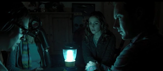
This shows an eerie atmosphere and shows how they all live there and how they have all played a major part in affecting this boys life by making him forget his family as they brain washed and processed him .

This shows that the characters look like they are praying that something bad doesn't happen to them
and they probably don't have any heat or lighting in the house so they are all gather around a lamp and huddled together while they figure out what to do next .

The character looks shocked and very scared they also don't know that their is a shadow behind them watching their every move , and that can make the audience want to tell the character and it can make the audience annoyed or frustrated that the character cant see what is behind them , so that is a good technique to have in a movie as both the audience and the characters can interact with each other
Opening Scene Analysis Two
The House at the end of the street is about a divorced mum and her daughter that move into the house of their dreams but when unexplainable things start to happen the character soon start to realise that the town they live in is holding a chilling secret.
The opening title of the movie creates a mystery as you want to know what the house is about by using the colour gold it suggests richness and wealth but in this term it could suggest lucky as they have finally found the house of their dreams . Whereas the black background suggest that something bad is going to happen to them and creates and enigma code for the audience an enigma code is where you put all the information together and you make a set of questions and clues in the film that later on get answered for the audience enigma codes were first invented by Roland Barthes . As you don't see anything wrong and you don't know what to expect next .
Whereas the font looks intimidating because some of the letters are in lower case and some are in capitals tons suggest that the characters need help and to draw the audience in . as it looks like the letters are trying to escape of the page this could suggest that they need to get out of there and that they don't know where to go next . also there is a line in the letters this could mean that the characters are feeling mixed emotions and that they don't know whether to go back to their previous lives or not as they may feel lost .
environment between the characters and what is happening to them . This shot is a medium close up as you can see the head and shoulders of the character.

The characters look like they are trying to come up with a situation to this problem they look like they are concentrated on what the problem is all about but the bars behind them could suggest that they feel trapped in the house and that they don't want to go out the house as something may happen to make their situation worse this shot is also know as a two shot because it shows the relationship between the two characters and helps to show how close these characters are too each other.

She looks frustrated and that she is going to go and find out what it is and try to put her plan in to action . And this type of shot is known as a low angle shot because it looking up down on the character .
Evaluation of my film
Evaluation of my film
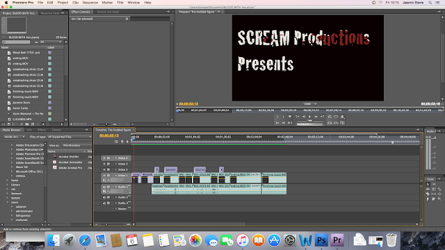
What I did first was that I made my title of my film on Photoshop and I then saved it as a PNG file and imported it to my film source files and I dragged it onto the first section of my film and how I made my title of my film on Photoshop is I had a black background and I then use a cracked font to create a dramatic and terrifying look for my audience by having a red faded colour behind the letters to create a blood affect and I also wanted to create the illusion of blood being splattered across the letters for my audience. I created an overlay texture this is where you take an image of blood splatters and then you place inside the text, I did this by hovering over the line between the two layers and you press the 'alt ' button and click .
I then created a title for my film using Photoshop and I used a cracked font because I wanted to create a sense of loneliness as the way in which the letters have been presented on the page is at an angle to make it look inviting but setting the mood for the audience as well . I used a font size of 72 to make the letters of my title stand out and the font i used was called cracked to create a uneasy and terrifying effect and i added this font by putting a new title over the top of my film and the video transitions that i used was a dissolve and fade to create a mysterious outlook for my audience. I added the video transitions by going to effect controls and clicking on video transitions then cross dissolve and fade.
I then went on to creating the credits of my film I did this by going into title, then clicking new title , then clicking on default still and a screen will appear where you can type in your text and i chose a red glow like font and bold letters to make my font stand out for my audience and the glow effect symbolises danger and I added a video transition over the top of my titles which you can get by clicking on the windows button at the top of the screen and then down to effects and clicking on video transitions and it will give you a wide variety of different options but I used the cross dissolve and fade .
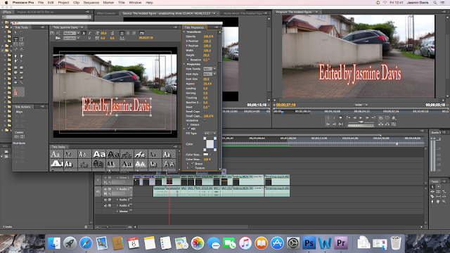
After you have selected a font that you wish to use you can begin to type the actors names that appear in your film and who edited your film as shown in the screen above I selected a red glowing font to symbolise blood and danger as well as triggering warning signs for my audience as you would not suspect anything to happen in a suburban place this refers to Roland Barthes use of enigma codes which are a series of different questions that eventually get answered later on for the audience as the films progresses and I wanted to create that sense of mystery throughout my film and by having a red glow effect to my titles and I wanted to recreate some of Roland Barthes use of action and enigma codes throughout my film as well as using a wide variety of different effects for my audience to experience and to trigger certains emotions for the audience to experiemce whilst watching my film.
I then placed the credits over the top of one of my scenes and choose how to my audience the names of the characters who may have starred in my film and I chose to position the titles in different ways by having some rotated and put down the side of the stair case to show a wide variety of different editing techniques. And I also put video transitions over the top of the titles of my film to make them dissapear slowly to create a ghost like effect and to draw my audience in to my film . I also cut tye credits of my film by usng a cut tool and dragging my film back to make the credits smaller . of my film to make sure that they were not too long as this can then make my audience lose interest in my film , if the credits are too long and I was trying to prevent that matter so I made sure that the credits of my film were short and didn't last too long .
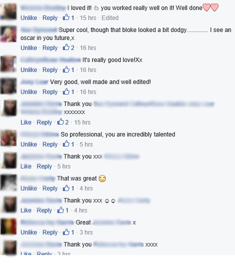 I then put my film on Facebook and got people to comment on my video to see what things my audience liked and disliked in my film and to see how I can improve the editing of my film for next time and most of my consumers meet my target audience of my film which is teenagers , having this feedback has helped me when it has come to filming my video because I can see what changes I need to make to my film and what mistakes I need to avoid for next time when filming a video
In what ways does your media product use, develop or challenge forms and conventions of real media products ?
My media product challenges forms of media products and conventions because I looked into three films these films included Carrie, House On The End Of The Street and Insidious , I have included elements of these media products in my film by having the location of my film set in a suburban environment because of the street in which the house is positioned in .
And I have used different ages for my characters because I have one teenager and two middle aged characters. The props that I have used are that I have had a fake axe and fake blood splattered on the walls , the costume of the characters are casual clothes like hoodies and jeans to symbolise innocence and to show that my film is relaxing at first but the pace of the film gets quicker the more you go into the film.
The plot of my theme is that I have two of my characters a mum and a daughter who are going to visit a house that they are thinking of buying. But the man who runs the house is very disturbed and he fancies the mum of the daughter but he doesn't know how to tell her because he finds it hard to communicate with women. He tries hard to impress her with the house but in the end his feelings go over the top and he ends up killing both the mum and the daughter instead and after he has killed them he starts to realise how much of a mistake he has made and this starts to effect him physiologically . The theme of my film is going to be horror but it has a sub genre as well because it is a horror film that has a physiological twist.
How does your media product represent particular social groups ?
My media product represents particular social groups because I have used the idea of having a male character as the killer and the female characters as the victims this shows a demographic stereotype because I am using examples of Angela McRobbie's theory which states that men are seen as strong and powerful characters whereas women are seen as weak and vulnerable and by using her theory in my filming . I am showing that even though this man appears to be confident and strong he is also weak because he doesn't know how to communicate with the characters properly and his physiological state is uneasy because he likes the mum in the film but doesn't know how to tell her properly .
What kind of media institution might distribute your media product and why ?
A media institution that might distribute my media product is Platinum Dunes. They are a company that specialize in horror films and they are a low budget company and this can help my film because low budget films can make a lot of money from the box office ratings to how many screenings I can get for my film to how many people want to buy tickets to see the film in the cinema. Also if you have any merchandise then you can get a lot of money because people who go and watch your film and enjoy it are going to tell other people and that then helps to increase the popularity of my film.
Who would be the audience for your media product ?
The demographic groups that my film would appeal to are teenagers because of the use of the camera angles and because of the use of the blood and gore and the different lighting techniques and because in my questionnaire it shows that teenagers are likely to want to watch horror films and this is the most popular age group of my audience. The needs that my production cater are that I have taken a twist on the traditional horror conventions by still keeping similar stereotypes by having a haunted house and by having blood on the walls . My production caters for people who like mystery as there are a few clues and hints in places , my film also caters for people who like a dramatic and intense ending , my production also caters for people who like to have different types of characters by having a character who is smart and loves to ask questions all the time to a character who may be shy and is bossed around a lot to a character who mysterious and uneasy.
How did you attract /address your audience ?
I attracted my audience to my film by using Roland Bathes Theory of enigma codes this is where you leave a bunch of hidden clues in the film for your audience to try to work out but these questions get answered later on into the film . I have also attracted my audience to my film by having dramatic and terrifying music and the use of the titles of my film because I have used a terrifying font that looks like blood is dripping behind the letters and I have used video transitions like dissolve and swiping the page over to make my film look dramatic and to draw my audience in .
What have you learnt about technologies from the process of constructing this product ?
I have learnt from technologies when constructing this product how to add music to my film I have learnt how to add titles and how to balance my audio and sound out so that they don't overlap each other otherwise it will be hard for my audience to hear the dialogue of the characters over the music and I have learnt how to add video transitions to my scenes to make them appear faster on and off screen .
Looking back at your preliminary task , what do you feel you have learnt in this progression from it to the full product ?
Looking back at my prelimary task I feel that the progression that I have made from this to my final product is that I now know how to use camera angles and lighting when shooting scenes . I also know how to add a new title of peoples names and how to change the font and position of a name by changing the colour and the font size to create a certain look for my audience . I also know how to make my scenes shorter by cropping them . I also know how to make something black and white to create an old fashioned and flash back appearance , i also know how to cut a clip by using a cut tool on Premiere Pro to make a clip longer or shorter.
How I could improve my video for next time
I could improve my video for next time by making the credits and opening titles of my film shorter as I felt that they were too long in places and lasted a long while on the screen before disappearing which could be a problem for my audience as they could become annoyed and uninterested in watching the rest of my film . I could improve the font choice of my credits by having them in a curved font to set the theme for my audience and I could use different video transitions by having a swipe effect or a bounce effect .
I could also improve my video for next time by using different sound effects and music and I could also improve my video by making sure that I use different texts and font sizes for the credits and titles of my film and I could make sure that when filming I cinsider using a range of different cmarea angles and shots like mediym close ups and establishing shots to help set the scene for the audience and to introduce the audience to my charcters more .
https://www.youtube.com/watch?v=AtIFFLMxrQI
Above is a link to my film Blood Bath .

What I did first was that I made my title of my film on Photoshop and I then saved it as a PNG file and imported it to my film source files and I dragged it onto the first section of my film and how I made my title of my film on Photoshop is I had a black background and I then use a cracked font to create a dramatic and terrifying look for my audience by having a red faded colour behind the letters to create a blood affect and I also wanted to create the illusion of blood being splattered across the letters for my audience. I created an overlay texture this is where you take an image of blood splatters and then you place inside the text, I did this by hovering over the line between the two layers and you press the 'alt ' button and click .
I then created a title for my film using Photoshop and I used a cracked font because I wanted to create a sense of loneliness as the way in which the letters have been presented on the page is at an angle to make it look inviting but setting the mood for the audience as well . I used a font size of 72 to make the letters of my title stand out and the font i used was called cracked to create a uneasy and terrifying effect and i added this font by putting a new title over the top of my film and the video transitions that i used was a dissolve and fade to create a mysterious outlook for my audience. I added the video transitions by going to effect controls and clicking on video transitions then cross dissolve and fade.
I then went on to creating the credits of my film I did this by going into title, then clicking new title , then clicking on default still and a screen will appear where you can type in your text and i chose a red glow like font and bold letters to make my font stand out for my audience and the glow effect symbolises danger and I added a video transition over the top of my titles which you can get by clicking on the windows button at the top of the screen and then down to effects and clicking on video transitions and it will give you a wide variety of different options but I used the cross dissolve and fade .

After you have selected a font that you wish to use you can begin to type the actors names that appear in your film and who edited your film as shown in the screen above I selected a red glowing font to symbolise blood and danger as well as triggering warning signs for my audience as you would not suspect anything to happen in a suburban place this refers to Roland Barthes use of enigma codes which are a series of different questions that eventually get answered later on for the audience as the films progresses and I wanted to create that sense of mystery throughout my film and by having a red glow effect to my titles and I wanted to recreate some of Roland Barthes use of action and enigma codes throughout my film as well as using a wide variety of different effects for my audience to experience and to trigger certains emotions for the audience to experiemce whilst watching my film.
I then placed the credits over the top of one of my scenes and choose how to my audience the names of the characters who may have starred in my film and I chose to position the titles in different ways by having some rotated and put down the side of the stair case to show a wide variety of different editing techniques. And I also put video transitions over the top of the titles of my film to make them dissapear slowly to create a ghost like effect and to draw my audience in to my film . I also cut tye credits of my film by usng a cut tool and dragging my film back to make the credits smaller . of my film to make sure that they were not too long as this can then make my audience lose interest in my film , if the credits are too long and I was trying to prevent that matter so I made sure that the credits of my film were short and didn't last too long .

In what ways does your media product use, develop or challenge forms and conventions of real media products ?
My media product challenges forms of media products and conventions because I looked into three films these films included Carrie, House On The End Of The Street and Insidious , I have included elements of these media products in my film by having the location of my film set in a suburban environment because of the street in which the house is positioned in .
And I have used different ages for my characters because I have one teenager and two middle aged characters. The props that I have used are that I have had a fake axe and fake blood splattered on the walls , the costume of the characters are casual clothes like hoodies and jeans to symbolise innocence and to show that my film is relaxing at first but the pace of the film gets quicker the more you go into the film.
The plot of my theme is that I have two of my characters a mum and a daughter who are going to visit a house that they are thinking of buying. But the man who runs the house is very disturbed and he fancies the mum of the daughter but he doesn't know how to tell her because he finds it hard to communicate with women. He tries hard to impress her with the house but in the end his feelings go over the top and he ends up killing both the mum and the daughter instead and after he has killed them he starts to realise how much of a mistake he has made and this starts to effect him physiologically . The theme of my film is going to be horror but it has a sub genre as well because it is a horror film that has a physiological twist.
How does your media product represent particular social groups ?
My media product represents particular social groups because I have used the idea of having a male character as the killer and the female characters as the victims this shows a demographic stereotype because I am using examples of Angela McRobbie's theory which states that men are seen as strong and powerful characters whereas women are seen as weak and vulnerable and by using her theory in my filming . I am showing that even though this man appears to be confident and strong he is also weak because he doesn't know how to communicate with the characters properly and his physiological state is uneasy because he likes the mum in the film but doesn't know how to tell her properly .
What kind of media institution might distribute your media product and why ?
A media institution that might distribute my media product is Platinum Dunes. They are a company that specialize in horror films and they are a low budget company and this can help my film because low budget films can make a lot of money from the box office ratings to how many screenings I can get for my film to how many people want to buy tickets to see the film in the cinema. Also if you have any merchandise then you can get a lot of money because people who go and watch your film and enjoy it are going to tell other people and that then helps to increase the popularity of my film.
Who would be the audience for your media product ?
The demographic groups that my film would appeal to are teenagers because of the use of the camera angles and because of the use of the blood and gore and the different lighting techniques and because in my questionnaire it shows that teenagers are likely to want to watch horror films and this is the most popular age group of my audience. The needs that my production cater are that I have taken a twist on the traditional horror conventions by still keeping similar stereotypes by having a haunted house and by having blood on the walls . My production caters for people who like mystery as there are a few clues and hints in places , my film also caters for people who like a dramatic and intense ending , my production also caters for people who like to have different types of characters by having a character who is smart and loves to ask questions all the time to a character who may be shy and is bossed around a lot to a character who mysterious and uneasy.
How did you attract /address your audience ?
I attracted my audience to my film by using Roland Bathes Theory of enigma codes this is where you leave a bunch of hidden clues in the film for your audience to try to work out but these questions get answered later on into the film . I have also attracted my audience to my film by having dramatic and terrifying music and the use of the titles of my film because I have used a terrifying font that looks like blood is dripping behind the letters and I have used video transitions like dissolve and swiping the page over to make my film look dramatic and to draw my audience in .
What have you learnt about technologies from the process of constructing this product ?
I have learnt from technologies when constructing this product how to add music to my film I have learnt how to add titles and how to balance my audio and sound out so that they don't overlap each other otherwise it will be hard for my audience to hear the dialogue of the characters over the music and I have learnt how to add video transitions to my scenes to make them appear faster on and off screen .
Looking back at your preliminary task , what do you feel you have learnt in this progression from it to the full product ?
Looking back at my prelimary task I feel that the progression that I have made from this to my final product is that I now know how to use camera angles and lighting when shooting scenes . I also know how to add a new title of peoples names and how to change the font and position of a name by changing the colour and the font size to create a certain look for my audience . I also know how to make my scenes shorter by cropping them . I also know how to make something black and white to create an old fashioned and flash back appearance , i also know how to cut a clip by using a cut tool on Premiere Pro to make a clip longer or shorter.
How I could improve my video for next time
I could improve my video for next time by making the credits and opening titles of my film shorter as I felt that they were too long in places and lasted a long while on the screen before disappearing which could be a problem for my audience as they could become annoyed and uninterested in watching the rest of my film . I could improve the font choice of my credits by having them in a curved font to set the theme for my audience and I could use different video transitions by having a swipe effect or a bounce effect .
I could also improve my video for next time by using different sound effects and music and I could also improve my video by making sure that I use different texts and font sizes for the credits and titles of my film and I could make sure that when filming I cinsider using a range of different cmarea angles and shots like mediym close ups and establishing shots to help set the scene for the audience and to introduce the audience to my charcters more .
https://www.youtube.com/watch?v=AtIFFLMxrQI
Above is a link to my film Blood Bath .
Thursday, 5 May 2016
Shooting Schedule
Location and shot number
|
Characters that are going to be in the scenes
|
Camera angle and camera movement
|
How long each shot will last for?
|
Scene one establishing shots of the house
|
No characters
|
Pan movements
|
2 seconds
|
Scene two Mum and Annie walking up to the house
|
Karen And Annie
|
Medium shot
|
1 second
|
Scene three
Living room
|
Paul
|
Medium shot
|
1 second
|
Scene four
Kitchen
|
Paul Annie and Mum
|
Medium shot
|
1 second
|
Scene five corridor
|
Paul Annie and mum
|
Long shot
|
2 seconds
|
Scene six
Stair case
|
Paul Annie and mum
|
High angle shot
|
1 second
|
Scene seven blood hand prints on the walls
|
No characters
|
Pan movements
|
1 second
|
Scene eight blood writing on the wall
|
No characters
|
Pan movements
|
1 second
|
Mise en scene considerations
Mise - en- scene considerations
My characters will need to wear casual clothes like jeans , t-shirts and hoodies and coats to show how they are normal people put in a slightly weird situation and to show the audience how they have coped with what is going on around them.
The props I will be using are an axe I will be doing this to show the psychological effects of the film as it makes you think about the characters because of the owner of the house
I wont need any make up but I think that I will need some special effects to be added to make it more dramatic and scary for the audience watching my film as it makes the footage look more tense and mysterious as you want to find out what is going to happen next the special effects that I will be adding to my film are e
Subscribe to:
Comments (Atom)


