Blood Bath
The genre of my film will be a hybrid of horror and comedy because the theme of my film will have some dark comedy and humour as well as having the dramatic and intense horror background.
A mother and daughter go to view a new house but little do they know that the house that they are so desperate to live is holding an evil , dark and mysterious and as for the landlord well would you trust him ? .
In the beginning of my film there is going to be establishing shots of the house introduce the location and setting to my audience then in the middle of the film there is going to be photo frames falling of the shelves and lights flickering as this shows the relation of the situation to the characters and the audience as the characters see that this house is not worth buying as unexpected things keep happening in the house and they are getting more frequent and intense by the minuet.
The title of my film is Blood bath and the hybrid genre of my film is horror , my film idea meets the specification of my genre because I have a wide range of characters with different personality traits as the daughter in my film is very shy whereas the mother in my film is confident and can be bossy at times whereas the man who is guiding them around the house appears calm but has an evil and creepy vibe about him. The location fits my film because of the feeling that the house looks normal from the outside draws the audience in to what is going to be happening in the film. The props that I am going to be using are an axe and fake blood on the walls I did this because I still wanted to stick to a traditional horror genre but I wanted to add humour to my film as well.
The different styles that I will use are that I will be using continuity editing to make my shots easy to follow and to draw my audience in and I will be using dark lighting and back and white filters to make my film scary and to make my film dramatic for my audience and I will be using medium shots and establishing shots as well as high and low angle shots the sound and music that I will be using is diegetic sound as their will be dialogue of the characters talking to one another as well as tense music in the background of my film to create tension and the anchorage text that i will be displaying to my audience will be in white letters with red splats behind it. As the colour white symbolises innocence and purity whereas the colour red symbolises blood and danger.
The first scene will be where the characters are walking up to the house I am doing this because I want the audience to get introduced to the characters and see different personality traits and it allows my audience to see what my characters are wearing .
The second scene is going to be where my characters are getting a tour of the house and are getting shown into the living room this is to introduce my audience to the different elements of the house and to introduce my audience to the man showing the mum and daughter round .
the third scene is where there is going to be a shot where the characters are going to be walking into the kitchen and the lights start flickering and going off and on.,
And scene four is going to be filmed in the corridor of the house and it is going to focus on the stairs and the characters walking up and there will also be sped up scary music being added because the mother and daughter will have their backs to the audience and this will be effective because there will be a close up of the axe behind the man's back to show his crazy and evil side then there will be a cut after the shot to show the shot of the bloody hand prints and writing on the wall before a scream sound effect and the screen will ten go pitch black before having credits rolling up .
Friday, 11 December 2015
Filming risk assessment
Risk assessment form
Hazards
|
Who is exposed
Who may be harmed
|
Level of risk
|
Control measures
Measures being taken to minimise risks identified
|
Level of risk once controls are in place
|
Roots and hanging down tree branches in the woods.
|
My actors who are walking and running through the
forest
|
Medium
|
Make sure I check the location out first and guide them to
a safer route if there is a hanging tree branch in the way
|
Low
|
Prop – bloody knife
|
Certain characters in my film.
|
High
|
Everyone keeps a safe distant from the knife and not to
run when holding the weapon. I would transport it by using fake bloody knife for transport and a real knife for the shot and killing of people .
It would be used in the scene by having the killer hold the knife before killing the person . |
Quite low because a fake knife will be used for transportation and i will make sure to give the actor a blunt knife when it comes to acting out the killing of the victim to avoid any injuries from happening.
|
Road outside my house
|
All characters crossing to get to the forest
|
Medium
|
Make sure that you are looking both ways and to be careful
as it can get busy at times.
|
Low
|
When the camera is on the tripod
|
All characters
|
Medium
|
Be careful of the tripod and warn everyone before filming
that scene that the tripod is there so that people do not trip over the legs
of the tripod.
|
Low
|
Wet mud
The stairs in my House Filming outside of my house |
All characters
All characters All characters |
High
Medium Medium |
Be careful when walking in the mud over the forest as
characters could slip and fall over so if you see a part of the forest with
mud then avoid it .
Make sure that any objects are out of the way of the stairs as actors could trip and fall over. Make sure to check if people are walking past the pavement and make sure that the tripod is set up and positioned properly. And check to see if the pavement is wet as my actors could slip and fall over. |
Low
Low Low |
camera and tripod tutorial
Camera and Tripod tutorial
Firstly when you are setting up your camera it will tell you to set up you will be expected to set up the date , time and time zone . once you have done that you will want to look through the viewfinder and press the shutter release button on top of the camera half way down until you hear a double beep this will confirm that the lens are in focus .
If you are new to using a camera like this then playing around with the different camera settings can be rather daunting at first i would suggest turning the mode dial on top of your camera to auto setting as the camera will automatically calculate the best exposure for you and you should be good to go .
When Operating the flash you will want to press the information button this is located behind the shutter release button a screen will appear this will say LCD monitor on it will show all the different camera settings press the i button located on the lower left corner of the LCD. Use the four way arrow keys surrounding the ok button and move until the flash mode a lighting bolt icon is highlighted in yellow .
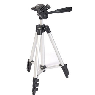
When setting up a tripod remember to extend the largest section of the legs first and the smaller sections at the bottom of the legs are less rigid then the thick top sections so these are more wobbly . Avoid raising the centre colum as this is the most unstable component of affordable tripods so avoid trying to film or take pictures in conditions when it is windy .
Make sure that the feet are stable on the ground as if the tripod is placed on a slippery surface like a rock or loose gravel then try to wedge the feet in position especially if you are shooting in a low angle.
Firstly when you are setting up your camera it will tell you to set up you will be expected to set up the date , time and time zone . once you have done that you will want to look through the viewfinder and press the shutter release button on top of the camera half way down until you hear a double beep this will confirm that the lens are in focus .
If you are new to using a camera like this then playing around with the different camera settings can be rather daunting at first i would suggest turning the mode dial on top of your camera to auto setting as the camera will automatically calculate the best exposure for you and you should be good to go .
When Operating the flash you will want to press the information button this is located behind the shutter release button a screen will appear this will say LCD monitor on it will show all the different camera settings press the i button located on the lower left corner of the LCD. Use the four way arrow keys surrounding the ok button and move until the flash mode a lighting bolt icon is highlighted in yellow .

When setting up a tripod remember to extend the largest section of the legs first and the smaller sections at the bottom of the legs are less rigid then the thick top sections so these are more wobbly . Avoid raising the centre colum as this is the most unstable component of affordable tripods so avoid trying to film or take pictures in conditions when it is windy .
Make sure that the feet are stable on the ground as if the tripod is placed on a slippery surface like a rock or loose gravel then try to wedge the feet in position especially if you are shooting in a low angle.
Saul Bass Essay
Saul Bass invented the opening sequences to titles of films and the designs that Saul Bass created were meant to be a solution to a particular problem , and his personal style was to create a story behind each film title he also helped to create logo designs . Saul; Bass designed opening sequences to films from 1954 to 1955 and his work also changed the way that people look at films . He got influenced to go into the graphic design field by contemporary designers like Josef Albers and Herbert Bayer their work and success gave Saul bass that hope he needed to succeed .
He got his first job working with Otto Preminger , Otto hired Saul Bass to design the film titles of his new film Carmen Jones in 1954 but there was a bit of a down side to why Otto hired Bass this was because Otto did not any respect for Saul Bass and his talent but Saul Bass did know that he would give him a chance to express it . But by getting ideas in the form of the new Swiss style Saul bass made the film title an important part of the cinema experience he used this technique in his documentary Bass on titles which was made in 2006 . Every time he went to create a film title he would always use the same three steps that he used for any design project these were that he saturated himself with the knowledge of the company , he then made sure that he understood the vision of the company and lastly he didn't try to symbolize a point of view . This method was very successful and this made Otto Preminger's next film The man with the golden arm more successful .
The colours red and blue connote sadness and danger this shows to the audience that the genre of this film is going to be an action or crime film because of the use of the silhouette of the hand as it is not telling the audience who the killer might be and you are creating a sense of mystery and concern for the audience as by looking at the poster of the film it is making you want to go and see in order to get your questions answered and therefore this poster is effective because it is persuading you to want to go and watch this film because of the use of the drawing and words on the front of the poster.
Also the choice of gold for the writing of the title of the film suggests that one of the characters could be from a wealthy background as the colour gold connotes royalty and richness suggesting that this character could have lots of money and the typography of the writing is in capital letters suggesting that the film is shaky in places and the style of the illustration is that the hand is facing down suggesting that this character might be on edge and might have a nervous side to them .
Some people didn't like The Man With The Golden Arm because they couldn't see how it was the peak of Saul bass's career as it was the first of a series of film titles that would break the boundaries of both technology and art . Saul bass then moved onto to film making and directing some examples of films that he helped make are the man who creates which won an Oscar he also created a science fiction called Phase IV , these films were both meant to combine images and with tight storytelling . Unfortunately after the film Phase IV didn't do so well he found himself having to rethink his career and that is when he decided to be a graphic designer between the years 1967 and 1991 , Saul Bass designed a range of different logos that looked very effortlessly but he filled every criteria with the same 3 stages approach without ever having to change his unique style and voice .
Some example of logos he created were :

Many artists turned to Saul bass for inspiration because Hollywood was facing strong competition , from 1990 to when Saul Bass died in 1996 a huge admirer of Saul Bass work Martin Scorsese hired him to do film titles for Good Fellars .
He got his first job working with Otto Preminger , Otto hired Saul Bass to design the film titles of his new film Carmen Jones in 1954 but there was a bit of a down side to why Otto hired Bass this was because Otto did not any respect for Saul Bass and his talent but Saul Bass did know that he would give him a chance to express it . But by getting ideas in the form of the new Swiss style Saul bass made the film title an important part of the cinema experience he used this technique in his documentary Bass on titles which was made in 2006 . Every time he went to create a film title he would always use the same three steps that he used for any design project these were that he saturated himself with the knowledge of the company , he then made sure that he understood the vision of the company and lastly he didn't try to symbolize a point of view . This method was very successful and this made Otto Preminger's next film The man with the golden arm more successful .
The colours red and blue connote sadness and danger this shows to the audience that the genre of this film is going to be an action or crime film because of the use of the silhouette of the hand as it is not telling the audience who the killer might be and you are creating a sense of mystery and concern for the audience as by looking at the poster of the film it is making you want to go and see in order to get your questions answered and therefore this poster is effective because it is persuading you to want to go and watch this film because of the use of the drawing and words on the front of the poster.
Also the choice of gold for the writing of the title of the film suggests that one of the characters could be from a wealthy background as the colour gold connotes royalty and richness suggesting that this character could have lots of money and the typography of the writing is in capital letters suggesting that the film is shaky in places and the style of the illustration is that the hand is facing down suggesting that this character might be on edge and might have a nervous side to them .
Some people didn't like The Man With The Golden Arm because they couldn't see how it was the peak of Saul bass's career as it was the first of a series of film titles that would break the boundaries of both technology and art . Saul bass then moved onto to film making and directing some examples of films that he helped make are the man who creates which won an Oscar he also created a science fiction called Phase IV , these films were both meant to combine images and with tight storytelling . Unfortunately after the film Phase IV didn't do so well he found himself having to rethink his career and that is when he decided to be a graphic designer between the years 1967 and 1991 , Saul Bass designed a range of different logos that looked very effortlessly but he filled every criteria with the same 3 stages approach without ever having to change his unique style and voice .
Some example of logos he created were :

Many artists turned to Saul bass for inspiration because Hollywood was facing strong competition , from 1990 to when Saul Bass died in 1996 a huge admirer of Saul Bass work Martin Scorsese hired him to do film titles for Good Fellars .


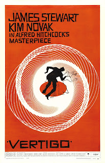
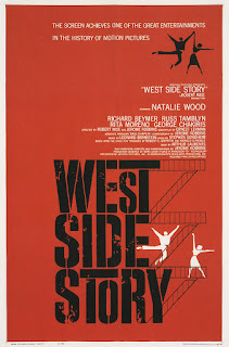
From the title posters above you can see that the techniques that Saul Bass uses are that he has a drawing to give a hint to the audience on what the film might be about and he tries to create a sense of mystery for the audience through each one of his posters and he uses a bold font to make the writing look dramatic and to make the letters stand out for the audience. And the techniques that define Saul Bass's style are the way in which he presents the writing on the page and the use of colour in the background as each colour fits a certain theme and gets across a message for the audience .
Saul Bass's opening sequences were effective in setting the mood for the audience because it would help to give the audience a clue on what the genre of the film might be about and Saul Bass used a wide range of different camera angles and the use of non diegetic sound to help build up tension is good to have in the opening as it helps to grab the audiences attention .
Saul bass was influential in the film industry because people started to see his hand written work and drawings and he started to get more recognition for his work as all his film posters tell a story for the audience have hidden clues for the audience to try and work out and each film has recurrent motifs.
Subscribe to:
Posts (Atom)

