He got his first job working with Otto Preminger , Otto hired Saul Bass to design the film titles of his new film Carmen Jones in 1954 but there was a bit of a down side to why Otto hired Bass this was because Otto did not any respect for Saul Bass and his talent but Saul Bass did know that he would give him a chance to express it . But by getting ideas in the form of the new Swiss style Saul bass made the film title an important part of the cinema experience he used this technique in his documentary Bass on titles which was made in 2006 . Every time he went to create a film title he would always use the same three steps that he used for any design project these were that he saturated himself with the knowledge of the company , he then made sure that he understood the vision of the company and lastly he didn't try to symbolize a point of view . This method was very successful and this made Otto Preminger's next film The man with the golden arm more successful .

The colours red and blue connote sadness and danger this shows to the audience that the genre of this film is going to be an action or crime film because of the use of the silhouette of the hand as it is not telling the audience who the killer might be and you are creating a sense of mystery and concern for the audience as by looking at the poster of the film it is making you want to go and see in order to get your questions answered and therefore this poster is effective because it is persuading you to want to go and watch this film because of the use of the drawing and words on the front of the poster.
Also the choice of gold for the writing of the title of the film suggests that one of the characters could be from a wealthy background as the colour gold connotes royalty and richness suggesting that this character could have lots of money and the typography of the writing is in capital letters suggesting that the film is shaky in places and the style of the illustration is that the hand is facing down suggesting that this character might be on edge and might have a nervous side to them .
Some people didn't like The Man With The Golden Arm because they couldn't see how it was the peak of Saul bass's career as it was the first of a series of film titles that would break the boundaries of both technology and art . Saul bass then moved onto to film making and directing some examples of films that he helped make are the man who creates which won an Oscar he also created a science fiction called Phase IV , these films were both meant to combine images and with tight storytelling . Unfortunately after the film Phase IV didn't do so well he found himself having to rethink his career and that is when he decided to be a graphic designer between the years 1967 and 1991 , Saul Bass designed a range of different logos that looked very effortlessly but he filled every criteria with the same 3 stages approach without ever having to change his unique style and voice .
Some example of logos he created were :

Many artists turned to Saul bass for inspiration because Hollywood was facing strong competition , from 1990 to when Saul Bass died in 1996 a huge admirer of Saul Bass work Martin Scorsese hired him to do film titles for Good Fellars .

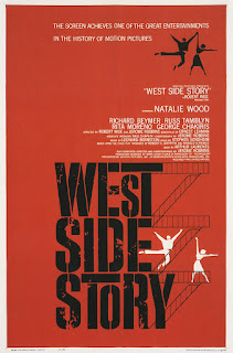
From the title posters above you can see that the techniques that Saul Bass uses are that he has a drawing to give a hint to the audience on what the film might be about and he tries to create a sense of mystery for the audience through each one of his posters and he uses a bold font to make the writing look dramatic and to make the letters stand out for the audience. And the techniques that define Saul Bass's style are the way in which he presents the writing on the page and the use of colour in the background as each colour fits a certain theme and gets across a message for the audience .
Saul Bass's opening sequences were effective in setting the mood for the audience because it would help to give the audience a clue on what the genre of the film might be about and Saul Bass used a wide range of different camera angles and the use of non diegetic sound to help build up tension is good to have in the opening as it helps to grab the audiences attention .
Saul bass was influential in the film industry because people started to see his hand written work and drawings and he started to get more recognition for his work as all his film posters tell a story for the audience have hidden clues for the audience to try and work out and each film has recurrent motifs.
No comments:
Post a Comment